ShopDreamUp AI ArtDreamUp

Deviation Actions


Description
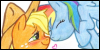
I did this like 3 weeks ago or something, but finally got it finished.
I have no idea why Applejack has wings, but I still made it, yay") love randomness.
love randomness.
I have no idea why Applejack has wings, but I still made it, yay
Image size
1024x768px 267.89 KB
© 2011 - 2024 xscaralienx
Comments28
Join the community to add your comment. Already a deviant? Log In
Very fitting to the characters <img src="e.deviantart.net/emoticons/s/s…" width="15" height="15" alt="
The posing works very well. The body language is perfect for the action, and there is of course precedent in the show for situations like this.
I like the simple background. You have the cloud-style down perfectly for the show. Nice shading, just the right level of detail. I'd like the clouds to be defocussed a little, to give some depth of field, and you may want to make the range of the sky's light-to-dark fade a bit less extreme (but only a little).
The characters are close to model. Well done! In the show the wings are usually drawn attached further to mid-back rather than at the shoulders, but I personally think they look a little better farther forward like this. No loss of points there. I also note and appreciate using the proper line-colors, and varying these colors correctly depending upon whether they are outlining body or hair. There is no tapering or line-weight variation on the linework; though the linework was done carefully it's plain that a circular brush was used. You may want to spend a little time there: taper lines to points where they come to an end, and make the lines on the undersides of body-elements heavier than the topside (this gives the appearance of weight). You might also want to taper point-to-heavier on lines where body elements are in front of other body elements (like the leading edge of the hindlegs where it is in front of the torso). This gives dimension and depth, a clear sense of "X is in front of Y", and makes a workable shorthand for a shadow too.
Details... the way the wings are drawn is not as close to the show's models as they could be. In the show, the primaries splay out almost like fingers when flapping, and Applejack's near wing looks a little odd (I'm trying to imagine how that fold would look from other angles, and it's not working out).
Only one leg out of eight is shaded. I can imagine how none of Rainbow Dash's legs would qualify if the lighting is coming from in front and above the characters (as the eye-reflections and standard lighting on the show for a daytime shot would indicate), but I think that Applejack's far foreleg would get the same treatment.
Rainbow Dash's hair, tail and mane seem to have the individual "locks" of hair a little blunt... where they leave the main body of hair, I would think that the points would be drawn out farther, sharper, more tapering.
Applejack's hair and tail indicate she's falling (they're upswept). Rainbow Dash's hair and tail are downswept, showing she's not falling. If Applejack is falling down past Rainbow Dash, you may want to include some sort of blur, speed-lines, or outline-echos to show Applejack's relative motion.
These critiques are all nitpicky. This is a fine, funny, true-to-character illustration. It stands well as-is. Be proud.